If you’ve recently looked at the GMAT Focus Edition syllabus and landed on the Data Insights section, your first reaction was probably something like: this looks manageable. Charts, tables, graphs. You’ve seen these your whole life - in textbooks, business reports, news articles.
Then you took a practice set, and the clock ran out before you finished question two.
Here’s what happened: you knew what the chart was showing. You just didn’t know how to read it efficiently under exam conditions. Those are two very different skills, and GMAT prep material almost never teaches the second one.
What the Data Insights Section Actually Tests
The Data Insights section comprises 20 questions and accounts for a third of your GMAT Focus score. It covers five question types: Multi-Source Reasoning, Table Analysis, Graphics Interpretation, Two-Part Analysis, and Data Sufficiency.
Of these, three (Multi-Source, Table Analysis, and Graphics Interpretation) are almost entirely about your ability to extract precise information from a visual or tabular display - quickly, accurately, and without second-guessing yourself.
The GMAT doesn’t test your deep knowledge of statistics. It tests your visual literacy: the ability to look at a chart type you may have never seen before, orient yourself in under thirty seconds, and answer specific numerical questions from it.
This is a learnable skill. But you have to practise it deliberately.
The Problem With “Just Do Practice Questions”
The standard advice - do hundreds of practice questions, review what you got wrong - has a critical gap when it comes to DI.
Most students who get a Graphics Interpretation question wrong don’t get it wrong because they failed to do the arithmetic. They get it wrong because they misread the chart itself. They confused the x-axis and y-axis. They read an absolute value when the question asked for a percentage change. They estimated from a bubble’s position when they should have read from the scale.
Reviewing a wrong answer tells you what you got wrong. It rarely tells you why you misread the chart in the first place, which is almost always because you didn’t know the specific conventions of that chart type.
A scatter plot has different reading rules than a bubble chart. A candlestick chart is read completely differently from a line chart, even though both use the same axes. A stacked bar chart and a grouped bar chart look similar at a glance but require entirely different interpretation techniques.
If you’ve never been formally introduced to a chart type, you will spend the first 30-45 seconds of the question just trying to figure out what you’re looking at. On a test where you have roughly 2 minutes per question, that’s fatal.
The Skill Most Test-takers Overlook: Visual Orientation
Here’s a framework that high scorers use instinctively, and that you can build deliberately.
When you encounter any chart on the GMAT, your first 20 seconds should follow a fixed sequence:
1. Identify the chart type. Is this a bar chart, a scatter plot, a waterfall chart, or a Sankey diagram? The type tells you the reading conventions.
2. Read the axes and units. What variable is on each axis? What are the units? Is the y-axis truncated (not starting at zero)?
3. Identify the legend. How many series or categories exist? What does each colour or pattern represent?
4. Note the scale and range. What’s the minimum and maximum on each axis? Where does most of the data sit?
Only then do you read the question.
This sequence sounds mechanical, but with practice it becomes automatic. The difference between an 80th-percentile and 99th-percentile DI performer is almost entirely how quickly this orientation phase happens.
Why Exposure to Chart Types Compounds
The GMAT uses an intentionally broad range of chart formats. In a single test session, you might encounter a standard line chart, a box-and-whisker plot, and a dual-axis chart.
The students who struggle are those who have only ever practised with the three or four most common chart types (bar, line, pie). The exam is specifically designed to include less familiar formats because those are the ones that reveal whether you can think systematically rather than pattern-match.
The good news is that visual fluency compounds. Each chart format you become comfortable with - even once, even briefly - shrinks the set of things that can surprise you on test day. A student who has spent ten minutes understanding how a Sankey diagram works will never again burn forty-five seconds just figuring out what one is. That time goes back to reading, calculating, and answering.
The goal isn’t to memorise every possible chart. It’s to build enough familiarity with the less common formats that your orientation phase stays fast regardless of what the exam puts in front of you.
The Chart Categories Worth Knowing Cold
Rather than thinking about chart types in isolation, it helps to organise them by what kind of information they present. Charts that show the same type of information share reading conventions - once you understand the logic of one, similar formats become much easier to orient in. (It is the classic targeted efforts versus distributed efforts)
Here are the major categories of data presentation you’ll encounter in a DI context, along with what each one is fundamentally about:
Comparison - Used to show how different entities measure up against the same metric. The data is discrete categories sitting on a shared scale, and the question typically asks you to identify the largest, smallest, rank a subset, or calculate a gap between two values. Examples: Bar Chart, Grouped Bar Chart, Stacked Bar Chart, Lollipop Chart, Slope Chart, Bullet Chart
Trend over Time - Used to show how a value changes across a continuous or sequential time period. The slope between two points carries as much information as the values themselves - steeper means faster change. Questions ask about growth rates, reversals, and comparisons between two specific periods. Examples: Line Chart, Area Chart, Stacked Area Chart, Step Chart, Dual-Axis Chart
Distribution - Used to show how data is spread across a range - where values cluster, where they thin out, and how skewed the shape is. Questions ask about the modal range, percentages above or below a threshold, or comparisons of spread between groups. Examples: Histogram, Box-and-Whisker Plot, Violin Plot, Dot Plot, Strip Plot
Part-to-Whole - Used to show how individual components add up to a total. All values are proportions of the same whole, and questions deal with percentage shares, converting proportions to absolute values, or comparing two categories’ combined share. Examples: Pie Chart, Donut Chart, Treemap, Waffle Chart, Pictogram Chart, Dot Matrix Chart, Sunburst Diagram
Correlation - Used to show whether and how two quantitative variables move together. The shape of the data cloud reveals the direction and strength of the relationship. A third variable may be encoded through bubble size or colour, adding a layer the question may test separately. Examples: Scatter Plot, Bubble Chart, Hexbin Plot, Prediction Interval Plot
Deviation - Used to show how values depart from a reference point - a budget, a baseline, a prior period, or zero. The chart encodes difference, not absolute level, so the first thing to establish is what the reference is and which direction is favourable. Questions ask for net cumulative variance, largest deviation, or revised outcomes if certain values are adjusted. Examples: Waterfall Chart, Diverging Bar Chart, Range Chart, Bullet Chart
Flow - Used to show how quantities move, split, or transform as they pass through a system or sequence of stages. These are among the least intuitive chart types on first encounter, and orientation - identifying sources, destinations, and what each flow represents - is most of the work. Questions ask about volumes along specific paths or proportional splits at each node. Examples: Sankey Diagram, Alluvial Diagram, Flowchart, Process Diagram
Hierarchy - Used to show how entities are structured into parent-child relationships or nested levels. The visual encodes containment and depth, not magnitude. Questions tend to ask about the size of a specific branch relative to the whole, or how many levels separate two nodes. Examples: Treemap, Sunburst Diagram, Tree Diagram, Organisational Chart, Dendrogram, Icicle Diagram, Donut Chart
Ranking - Used to show the ordinal position of entities over time or across conditions - not their absolute values. The y-axis encodes rank, not magnitude, and the most information-dense moments are where lines cross, indicating a position swap. Questions ask which entity held a specific rank the most, or when a particular rank change occurred. Examples: Bump Chart, Lollipop Chart (ranked)
Multivariate - Used to compare multiple attributes of multiple entities simultaneously. These formats compress three or more variables into a single visual, which makes them visually complex. The reading strategy is disciplined: isolate one variable at a time before comparing across entities. Examples: Radar Chart, Parallel Coordinates Plot, Heatmap
Scheduling - Used to show when tasks begin, how long they last, and which tasks run in parallel or in sequence. Duration is encoded as bar length, not height. Questions ask about task dependencies, total project duration, the impact of a delay, or which tasks overlap. Examples: Gantt Chart, Timeline Chart
Uncertainty - Used to show that a value or relationship is an estimate with a range, not a precise point. These charts appear in contexts involving forecasts, regressions, or survey data. The key skill is reasoning about whether two ranges overlap or whether a specific value falls within a stated interval. Examples: Error Bar Chart, Box-and-Whisker Plot, Prediction Interval Plot
Networks - Used to show connections between entities where neither axis encodes a quantitative variable - only the presence, absence, or strength of relationships matters. Spatial position of nodes is determined by layout algorithms, not data values. Questions ask about the most connected node, the shortest path between two nodes, or whether two nodes are directly or indirectly linked. Examples: Network Diagram, Force-Directed Graph, Arc Diagram, Chord Diagram
Conceptual - Used to show set membership, logical relationships, or categorical overlaps rather than numerical magnitude. The reading challenge is translating a visual structure into a precise logical or arithmetic statement - particularly the inclusion-exclusion principle for overlapping sets. Examples: Venn Diagram, Euler Diagram, Matrix Diagram, SWOT Diagram, Mind Map, Cycle Diagram, Pyramid Diagram
Geospatial - Used to show data that has a geographic dimension, where location itself is part of the story. The base map provides context; the data layer (colour, bubble size, or dot density) encodes the variable being measured. Questions ask about regional comparisons, highest/lowest value regions, or proportional differences between locations. Examples: Choropleth Map, Bubble Map, Dot Map, Flow Map
What Good DI Practice Actually Looks Like
Once you know the chart types, here’s how to structure your practice:
- Phase 1 - Visual introduction: For each chart type, study its structure with no question attached. What are its axes? What does each visual element encode? What reading conventions are specific to this type? This takes 5-10 minutes per chart type, and you only do it once.
- Phase 2 - Sample question with feedback: Work through at least one realistic question for each chart type. Don’t just check whether you got it right - understand the chain of reasoning: how to read the chart, what the question was actually asking, and what the worked solution looks like step by step.
- Phase 3 - Timed repetition on weak areas: Once you’ve covered all chart types, do timed sets with a focus on the categories where your accuracy is lowest.
Most students skip Phase 1 entirely and jump straight to questions. This is why they keep making the same orientation errors across dozens of practice sets without improving.
A Resource Built Around This Gap
If you want a structured way to work through Phase 1 and Phase 2 of the process above, the GMAT Data Insights Visual Library - built by the team at GMATPoint - was designed specifically to fill this gap.
The library covers 40 chart types across 14 categories, each with an interactive visualisation rendered from realistic sample data, a three-part breakdown (description, use cases, and GMAT relevance), practical reading tips, common mistakes to avoid, and an authentic GMAT-style fill-in-the-blank question with a full worked solution.
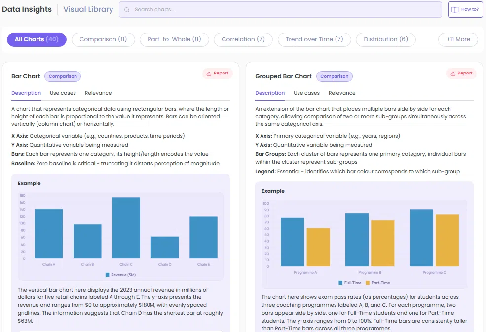
*An image of the Visual Library home page. The image shows 2 out of the 40 available charts.
A subset of charts is freely accessible. The full library, along with the AI Tutor and additional practice questions, is included in GMATPoint Premium.
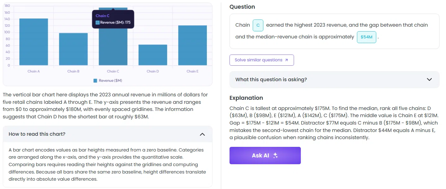
*An explanation included with every practice question along with a guide into reading the chart itself.
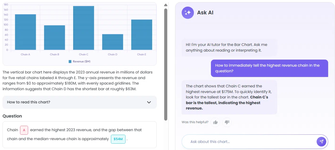
*The AI tutor explains how to efficiently draw insights from every type of chart. An example question is included in every chart along with a link that takes you to similar questions to aid your targeted practice.
It’s not a question bank. It’s a visual reference - the thing that should come before the question bank, and that most test-takers have never had.
The Broader Principle: Data Literacy Is a Transferable Skill
One thing worth noting: the skill you’re building for the GMAT doesn’t stay in the GMAT.
The business world runs on dashboards, data rooms, and visual reports. The ability to walk into a meeting, look at an unfamiliar chart, and immediately understand what it shows and what questions it can and can’t answer - that’s a professional skill that consultants, analysts, and MBAs use daily.
The GMAT’s Data Insights section is, in some sense, a proxy test for this. It’s asking: can you think systematically about visual information under pressure?
The students who approach it that way - as a reasoning skill to build, not a question format to game - are the ones who improve fastest. And the improvement tends to be durable, because it’s grounded in understanding rather than memorisation.
Where to Start
If you’re early in your prep and haven’t started DI yet: begin with the Comparison and Trend over Time categories. These will appear in almost every practice set and give you the foundation. Work through bar charts and line charts until the orientation phase is fully automatic.
If you’re mid-prep and your DI accuracy has plateaued: audit your wrong answers by chart type. You’ll almost certainly find that your errors cluster in two or three categories. Go back to the visual reference for those types, re-read the conventions, and then do targeted question practice.
If you’re close to your test date and looking for high-leverage prep: don’t start new categories from scratch. Instead, audit your recent wrong answers and identify the specific orientation mistake - not the arithmetic error, but the moment you misread the chart. Was it a scale issue? A legend you didn’t check? A format you hadn’t seen before? Fix the pattern, not the individual question. One targeted session on the right chart category will do more in two days than twenty questions answered without understanding why you got them wrong.
Wherever you are in your prep, the principle is the same: you can’t outpace the clock by working harder at questions you don’t fully understand. Build the required visual fluency first.
Check out our YouTube video on solving an interesting Box-and-Whisker Plot:
Master GMAT Data Insights #1: How Do You Solve A Box and Whisker Plot?